
Sherwin Williams Agreeable Gray Paint Color Review
Are you looking for a beautiful neutral paint color to add in your home? If so, you’ve probably come across Agreeable Gray by Sherwin Williams. It’s one of the most popular neutral paint colors! It was actually the main color for the walls at our first house, the California Cottage. Today I want to share with you my paint color review for Agreeable Gray Sherwin Williams to help you decide if it’s the right color for your home!
What does Sherwin Williams Agreeable Gray look like?
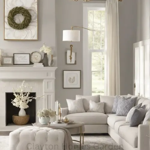
Sherwin Agreeable Gray is a gray paint color that is neutral and warm. It has undertones of beige and is sometimes described as a greige. It’s the perfect choice if you want a neutral color that is versatile, works in many different spaces and looks beautiful in all paint sheens. It’s a popular choice for good reasons!
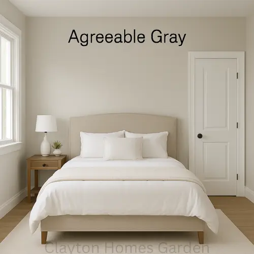
Sherwin Williams Agreeable Gray: Paint Color Review
Are you looking for a beautiful neutral paint color to add in your home? If so, you’ve probably come across Agreeable Gray by Sherwin Williams. It’s one of the most popular neutral paint colors! It was actually the main color for the walls at our first house, the California Cottage. Today I want to share with you my paint color review for Agreeable Gray Sherwin Williams to help you decide if it’s the right color for your home!
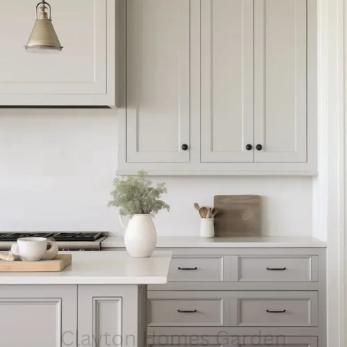
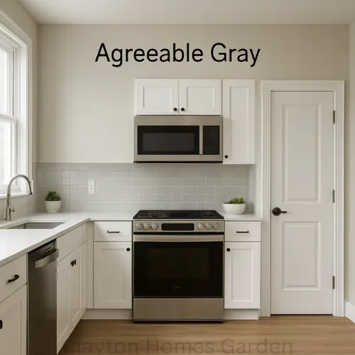
Agreeable Gray walls with white kitchen cabinets
Below is a picture of Sherwin Williams Agreeable Gray with white kitchen cabinets. I used Sherwin Williams Pure White for the cabinets. I think Pure White pairs really well with Agreeable Gray Sherwin Williams!
You can see how the tone of Agreeable Gray changes depending on the natural light and the shadows! The left side has more sunlight and Agreeable Gray looks more beige and like a warm gray. On the left side, that is slightly darker with less sunlight, it looks more like a true gray.
Why is Agreeable Gray so popular?
Sherwin Williams Agreeable Gray is one of the most popular colors because its a beautiful neutral color. Greige colors have been a popular choice, especially for walls and kitchen cabinets over the last few years. Agreeable Gray is a pretty neutral shade of gray with few undertones. This greige paint color looks beautiful in a variety of paint sheens. That makes it perfect for a lot of different spaces and applications!
What is the LRV of SW Agreeable Gray?
The Light Reflectance Value (LRV) of SW Agreeable Gray is 60. LRV measures the percentage of light a paint color reflects. It’s measured on a scale from zero (absolute black, absorbing all light and heat) to one hundred (pure white, reflecting all light). This means that Agreeable Gray by Sherwin Williams is on the lighter side but much darker than white.
What undertones does Sherwin Williams Agreeable Gray have?
Sherwin William Agreeable Gray is a unique greige that doesn’t show a lot of colors in its undertones. This makes Agreeable Gray easier to pair with other colors. Sherwin Williams Agreeable Gray undertones show hints of violet, green and blue depending on the light and the space.
Accessible Beige versus Agreeable Gray
Sherwin Williams Agreeable Gray is kind of like a sister to Sherwin Williams Accessible Beige which is a beige paint color that is neutral and warm but has undertones of gray. Accessible Beige is another popular paint color in the greige family. It’s pretty much the opposite of Agreeable Gray but similar. Accessible Beige leans more toward the warmer side of the color spectrum due to its beige undertones. It’s a great choice for a more transitional look. We used Sherwin Williams Accessible Beige in a satin sheen for the kitchen cabinets and in a semi-gloss sheen as a trim color on the baseboards and doors at the Hills House:
Repose Gray versus Agreeable Gray
Repose Gray is another greige color that is often compared to Agreeable Gray. That makes Repose Gray a little darker than Agreeable Gray. It’s also a little less beige in comparison. Repose Gray would be a great choice if you’re looking for a color that is closer to a true gray than Agreeable Gray.
Revere Pewter Vs Agreeable Gray
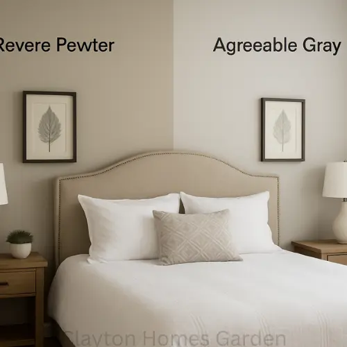
If you’re wondering “what is the Benjamin Moore equivalent to Agreeable Gray?” some people might answer that it’s Revere Pewter! However, Revere Pewter by Benjamin Moore has an LRV of 55, so it’s a bit darker. Revere Pewter has similar undertones as Agreeable Gray with a little more green in the background.
Fun fact about Benjamin Moore Revere Pewter: Christina from Flip or Flop said they “use this in 90 percent of our flips - for every room. It makes furniture look great, and buyers love it.” So if you’re looking for a tried and true neutral color, Revere Pewter might be another great option!
What colors compliment Sherwin Williams Agreeable Gray?
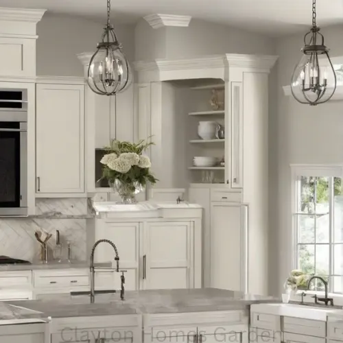
As far as deciding what goes with Sherwin Williams Agreeable Gray, I’ve combined it with Sherwin Williams Pure White in our kitchen:
Agreeable Gray kitchen walls
I’ve also combined this gray paint color with baseboards, trim and doors that were Sherwin Williams Extra White:
Agreeable Gray walls with Extra White trim
When I was deciding on the color scheme for the California Cottage, I considered Sherwin Alabaster baseboards with Agreeable Gray walls but found that Alabaster was too warm and not contrasting enough.
On the Sherwin Williams website, they also share what colors match Sherwin Williams Agreeable Gray:
Incredible White SW 7028 (though I haven’t combined this with Agreeable Gray, I did use Incredible White in the primary bathroom alongside Pure White)
Sherwin Williams paint sample on exterior wall
That’s what I did for the California Cottage exterior paint and we ended up loving our Sherwin Williams Oyster Bay exterior!
I hope you found this paint color review of Sherwin Williams Agreeable Gray helpful! Do you have a favorite neutral paint color that you’ve used and love? Let me know in the comments!