
10 Blue Living Room Ideas to Boost Serotonin & Soothe Your Soul

Blue is the most powerful colour you can use in your living room
Blue is more than just a color. It is also a psychological experience. According to environmental psychology research, exposure to blue shades lowers cortisol, reduces heart rates, and activates parasympathetic nerve system — the body’s “rest and digest” mode. A blue living room can be a scientifically relaxing living room.
Blue is the most popular colour in the world. A survey in 10 countries found that blue was chosen by 40% of respondents as their favourite colour. A blue living room will appeal to nearly every guest, buyer and homeowner. This is a rare colour which is both daring and safe.
Interior designers have known for a long time what science has now confirmed. Professional decorators use the 60-30-10 rule, which is a foundational framework for choosing colours. Blue is often used as the dominant 60% colour in a room due to its ability anchor the space without being overwhelming. Blue creates a “restorative sanctuary”: a space you can’t wait to come back to.
Learn More, Everything You Need to Know About RTA Cabinets
The Best Blue Living Room Design Ideas for 2026
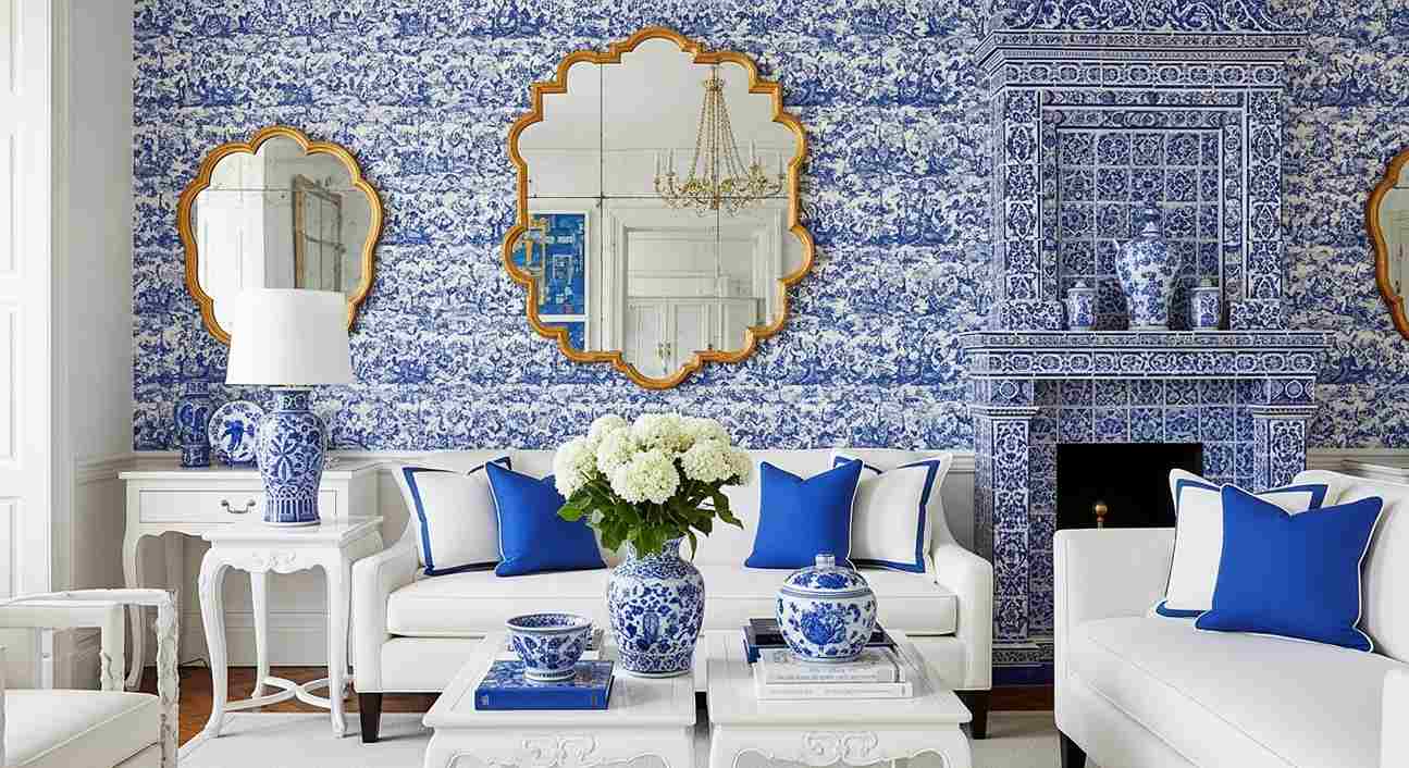
Design 01: French Provincial Blue – Dusty Blue Walls and Gold Antique Accents

Timeless Elegance
Colour Palette Dusty Blue/ Warm Gold/ Ivory White
Vibe: An old-world European charm meets a calming sanctuary
Key Design Elements:
- Dusty blue panels with white crown molding
- Light Blue Slipcovered Wingback Armchair
- Mirror with ornate gold frame above white marble fireplace
- Crystal candelabra chandelier
- Persian style blue and ivory area Rug
- The glass and wood coffee table is a combination of antique wooden side tables.
- Recommended Paint: Benjamin Moore – Smoke Blue 2067-40 or Farrow & Ball – Mizzle
- Ideal for: Vintage, traditional, and European inspired homes
Why it Works: Dusty Blue is the most universally soothing shade of blue. According to color psychology research, muted blues can reduce cortisol by as much as 11%. This palette is therefore scientifically soothing. Gold accents provide warmth and prevent the room from being cold, a mistake that is often made with all-blue interiors.
Must Read , 10 Japandi Guest Room Ideas: Minimalist Designs for a Calm Stay
Design 02: Navy Velvet Luxurious — Deep Navy Sofa With Crystal Chandelier And Gold Coffee Table

Dramatic sophistication
Colour Palette: Deep Navy Blue/ Champagne Gold/ Warm Cream
Vibe: 5 star hotel living room energy
Key Design Elements:
- The Tufted Navy Blue Velvet Chesterfield Sofa
- Round gold coffee table ornate with glass top
- The walls are a soft grey-blue colour.
- Crystal ball chandelier
- Oil painting of a large botanical in muted shades
- Champagne and silver linen throw pillows
- Recommended Paint: Farrow & Ball Hague Blue or Dulux Midnight Isle
- Ideal For: Formal living rooms, luxury interiors and high ceilings
Why it Works: Navy creates an intimate and enclosed feeling, perfect for formal living areas where you want your guests to feel ensconced in luxury. When paired with gold, navy activates brain reward pathways and creates a sense of abundance and exclusivity.
Design 03: Blue Baroque Library – Slate Blue Walls, Vintage Bookshelves, and Tufted Velvet sofas

Mood: Intellectual Romance
Colour Palette: Slate Blue / Antique Gold / Rose Blush
Vibe: French Baroque Library meets Bohemian Collector
Key Design Elements:
- Ornate slate blue wall panelling with Baroque carvings
- Floor-to-ceiling antique bookshelves on both sides
- Powder blue velvet sofa with carved legs
- Blush Pink Armchairs with French Style Legs
- Round ottoman in blue velvet with tufting as a coffee table
- Blue Persian-style medallion rug
- Gold candelabra chandelier
- Benjamin Moore HC-156 Van Deusen Blue or Sherwin Williams ‘Dignified.’
Best For: Book lovers, collectors, vintage decor enthusiasts, maximalist homes
Why it Works: Blush pink and blue is a color combination that has a psychologically harmonious effect. The contrast creates visual interest, while the palette is still soothing. This makes it perfect for reading rooms.
Design 04: Coastal Hamptons Blue – White Shiplap walls with navy accents and linen sofas

Relaxed coastal luxury
Colour Palette: Crisp white / Navy Blue/ Sandy Beige
Hamptons Beach House Casual Elegance
Key Design Elements:
- White Shiplap Wall Panelling
- Linen sofas in oatmeal or off-white
- Anchor-patterned cushions and navy blue throw pillows
- Woven jute rug
- Coffee table made of bleached driftwood
- White and navy striped curtains
Accent chairs made of rattan or wicker
Benjamin Moore – ‘Chantilly Laces’ with ‘Hale Navy Accents’ is a recommended paint.
Ideal for: Beach houses, coastal homes, and rooms with lots of light
Why it works: The combination of white and navy mimics visual cues from the sky and ocean — both environments that have been proven to reduce anxiety. Ocean-inspired palettes are proven to lower heart rates and promote a feeling of spaciousness, according to research on biophilic design.
Design 05 – Earthy Boho Blue – Indigo, Terracotta and Macrame with Woven Textures

Mood: Grounding & Free-Spirited
Colour Palette: Indigo Blue / Warm Terracotta / Natural Linen
Vibe: Moroccan bazaar meets Californian boho
Key Design Elements:
- Indigo accent wall with warm terracotta adjacent walls
- Low-profile floor cushion in indigo or rust
- Macrame wall hanging over the sofa
- Woven rattan side tables
- Throw blanket in blue shibori dye
- Terracotta pots with trailing plant
- Tribal-pattern rugs with layers
Paints to use: Farrow & Ball Pitch Blue’ and Valspar Midnight In the Garden’
Best for: Boho and eclectic interiors
Indigo is a color that’s associated with depth and intuition in color psychology. When combined with terracotta, a warm earthy tone, it creates an energizing yin-yang color palette. Blue is decorated with a dopamine-inspired approach.
Design 06: Scandinavian Ice Blue – Pale Blue Walls and White Furniture with Natural Wood

Mood: Airy, Clean & Serene
Colour Palette: Ice Blue, Pure White and Warm Oak
Vibe: Nordic minimalism with Soul
Key Design Elements:
- Pale Ice Blue Walls in Flat Matte Finish
- Simple white linen sofa with clean lines
- The natural oak wood coffee tables and shelves
- Throw white sheepskin over armchair
- Abstract art with minimal frame
- Linen curtains off-white
Greenery: Potted eucalyptus, olive branches or ferns
Recommended Paint: Dulux “Nordic Sky” or Benjamin Moore “Ice Blue 2057-20′
Ideal for: Small living rooms and rooms facing north.
Why it Works: Pale blue walls can reflect up to 15 percent more light than neutral gray — this is why Scandinavian designers prefer pale blues for climates with low levels of sunlight. The combination of white and oak creates warmth that prevents the icy feeling that many homeowners dislike when it comes to blue walls.
Design 07: Moody Navy Maximalist – Dark Navy walls with Bold prints and Jewel Tones

Bold and Cocooning
Colour Palette: Dark Navy, Emerald Green and Burnt Amber
Vibe: Jewel Box Living Room — Maximalist done right
Key Design Elements:
- Dark navy walls painted from floor to ceiling
- Emerald green velvet armchair – a statement piece
- Amber Brass Floor Lamp and Candlestick Holders
- Vintage botanical prints in dark frames – Gallery wall
- Persian rug in deep jewel tones
- Layered cushions combining prints and solids
- Recommended Paint: Farrow & Ball Hague Blue or Little Greene Dock Blue
Best For: Evening rooms, formal sitting rooms, confident decorators
Why it Works: Dark navy walls produce what designers call an ‘envelope’ effect — the room wraps you around like a cocoon. Environmental psychology studies show that enclosed, darker spaces can increase feelings of intimacy and security, making conversations more meaningful.
Design 08: Blue Maximalist Chinoiserie – Cobalt Blue Patterns and White Lacquer
Eclectic Global Elegance
Colour Palette: Cobalt Blue/Pure White/Glossy Lacquer
Vibe: European salon meets Asian art tradition
Key Design Elements:
- Cobalt Blue and White Chinoiserie-Print Wallpaper
- White lacquered side tables and coffee tables
- Collection of blue and white porcelain vase
- Sofa in solid White with Cobalt Trim Pillows
- Blue and white tiled fireplace surround
- Gold mirror with scalloped frames
- Use ‘Cobalt Blue” wallpaper by Schumacher, Cole & Son or as a recommended paint.
Best For: Eclectic maximalist homes, art collectors, pattern lovers
Cobalt blue is the most saturated blue color. Color psychology says that saturated blues can stimulate mental clarity and creativity. This is why cobalt, from Moroccan mosques to Delft ceramics, has been used for centuries in sacred spaces.
Design 09: Mediterranean Blue – Terracotta tiles with Cerulean Blue walls and arched doorways

Sun-Kissed and Warm
Colour Palette: Cerulean blue / Warm Terracotta/Whitewash
Vibe: Greek Island villa brought to your living room
Key Design Elements:
- Cerulean Blue Limewashed Walls
- Terracotta tiles or terracotta area rug
- Arched window frames or white plaster arches
- Low sofa in terracotta with white and blue cushions
- Iron candle holders, lanterns
- The trailing jasmine and bougainvillea are planted in pots made of clay.
Paints to use: Farrow & Ball Lulworth Blue or Portola Paints Santorini
Ideal for: Homes in warm climates, homes with open-plan layouts, holiday homes.
Why it Works: Cerulean Blue — the exact shade of the Aegean sea — has consistently been rated as the most popular colour worldwide in surveys. The mid-tone warmth of this blue makes it a versatile choice for living rooms.
Design 10: Blue Velvet Hollywood Glam – Sapphire Blue Velvet and Mirrored Furniture

Old Hollywood Glamour
Colour Palette: Sapphire blue / Mirror silver / ivory
Vibe: 1940s Hollywood glamour reinvented for contemporary living
Key Design Elements:
- Sapphire blue velvet tufted sofa
- Mirrored consoles and side tables
- Silver metallic wallpaper or silver leaf accent wall
- Chandelier crystal drops
- Throw in ivory faux fur
- Art Deco geometric carpet in blue and silver
Recommended Paint: Benjamin Moore’s ‘Sapphire Berry 2067-30’, or Behr’s ‘Evening Blue.
Best For: Glamorous apartments, boutique hotel-inspired spaces, maximalists
Why it Works: Velvet adds tactile depth to blue, amplifying the experience. The way the velvet catches the light creates subtle variations in tone across its surface.
What is the right shade of blue for your living room?
Blue is a color that can be misunderstood if you choose the wrong shade. The way blue behaves depends on where your room is located and how much natural light you receive.
North-facing rooms
The light that enters rooms facing north is cool and indirect. Avoid cold blues such as pure cerulean and icy white-blue in these areas. They will feel harsh and unwelcoming. Choose warm blues that have grey or green undertones, such as dusty blue or slate blue. Farrow & Ball’s ‘Oval Room Blue’ and Benjamin Moore’s ‘Smoke Blue’ are both excellent choices.
South-facing rooms
South-facing rooms are flooded with warm direct sunlight, which can make the blues look lighter and more vibrant. You can be bolder with navy, sapphire, or cobalt. They will feel less oppressive in the sunlight.
Small Living Rooms
Blue can make a room appear larger, but only if it is used correctly. Light blues, such as powder blue, ice sky, and pale skies, reflect light, making walls appear to be further away. Dark navy is best avoided in small rooms, unless you want to create an intimate and cocooning atmosphere.
Large Living Rooms
Deeper blues, such as navy, hague, or cobalt, give large living rooms a feeling of warmth and definition. Blue walls in large, light-filled spaces can be cold and clinical without a saturated color.
Blue living rooms can benefit from the 60-30-10 rule
Interior design is based on the 60-30-10 rule. How to apply the 60-30-10 rule to a living room in blue:
* 60% — Dominant color: blue walls, blue sofa or blue area rug.
Use neutrals such as white, cream beige or warm grey as a secondary colour to avoid blue being overwhelming.
* 10% — Accent color: Metallics for visual interest (gold, bronze, silver), terracotta or blush.
Most people make the mistake of using blue on all three levels at once — blue sofa, blue walls AND blue cushions. It creates an unbalanced monochromatic look that is heavy and flat. To balance the look, you should always use a neutral warm tone.
Final Thoughts – Blue is not a trend – it is a timeless investment
Blue is a permanent color. Blue has been a staple of interior design since the dawn of recorded history. From the lapis-lazuli walls in ancient Persia, to the Yves Klein canvases from 20th century Paris. It represents depth, calm and aspiration.
These 15 living room designs represent a wide range of blues, from the subtle serenity and calm of Japandi slate to the boldness of cobalt. This guide has a design for a blue living space that is suitable for any style, budget or size of room.
Choose your neutrals. Choose your neutrals. Add a warm accent. Stand back and let the blue do what has been done for thousands years: create a feeling that you are exactly where you should be.